
Edge Impulse is a developers-first company enabling hobbyists, data-scientists, and hardcore engineers to build sophisticated machine learning models to detect rich events across sensors, MCUs, and other IoT devices. With the ease of use, data richness, and by capturing 90% of data previously discarded, we help people build better, and more useful products that resonate with humans and machines alike. In this blog post, we’ll show some really great recent improvements to our data visualizations, including how to detect and update mislabeled data, validate your signal processing pipeline parameters, and how you compare test data with your training set.
Tracing back items in the feature explorer
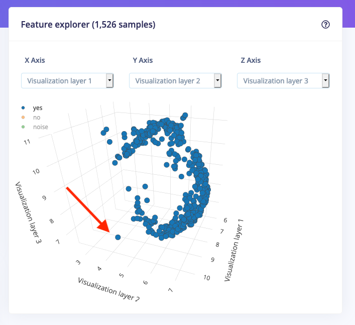
The feature explorer is one of the most fun options in Edge Impulse. In the feature explorer, all data in your dataset are visualized in one 3D graph. The axes are the output of the signal processing process (we heavily rely on signal processing to extract interesting features beforehand, making smaller and more reliable ML models), and they can let you quickly validate whether your data separates nicely. You don’t have to second guess your results -- all you have to do is take a quick look and make an informed decision, fast.
You can now hover over any point in the feature explorer, which will show you the source data item. Clicking on a data item will reveal the raw waveform, the window that was used from the signal (if you deal with time series data), and you can quickly click through to the signal processing screen. This makes it very easy to find out which data points are outliers in your dataset.
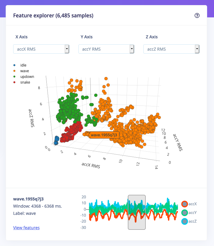
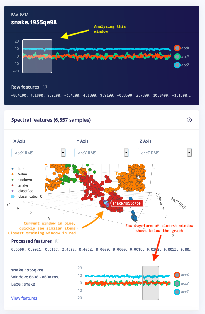
In addition, this helps you find similar data during model testing. When you now load new data during live classification or view the classification result for a sample in your test set, you can visually see which data items in your training set are closest.
Dimensionality reduction
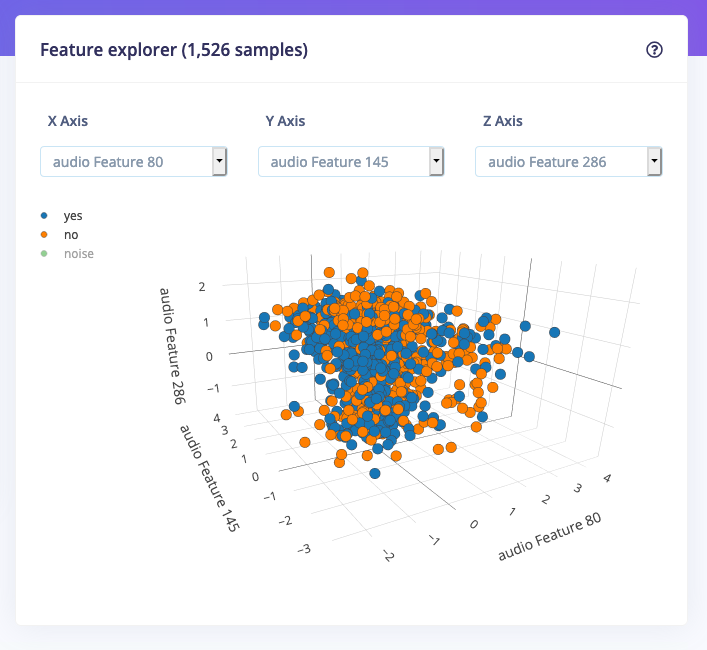
Using the feature explorer you can inspect three features at the same time, which works great for low-dimensional data with an internal structure like accelerometer data, but gets really messy if you deal with high-dimensional data like audio. To deal with this you can now also enable dimensionality reduction. If you enable this we’ll use UMAP to calculate three artificial features that we’ll use to visualize your dataset. This makes it much easier to deal with this kind of data.
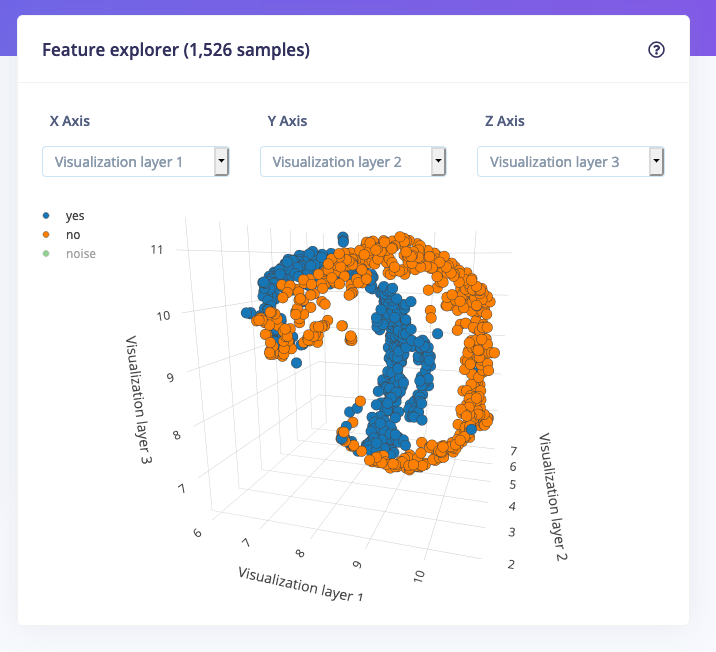
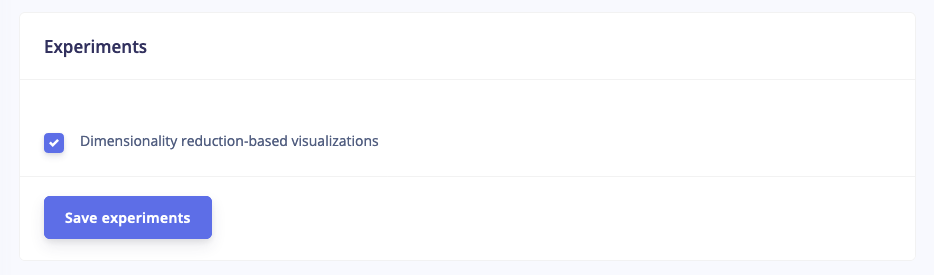
To enable these visualizations, go to your project dashboard, and enable Dimensionality reduction-based visualizations:
Finding mislabeled data
This now also makes it much easier to find mislabeled data in your dataset. You can click on the labels in the legend to hide those samples, and any data that is far away from the main cluster can be inspected. For example, this item looks suspicious:
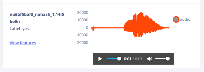
By clicking on this data point the sample automatically shows at the bottom, and you can directly listen to the audio fragment. In this case, this is a mislabeled item, and you can quickly correct this.
Want to try this out? To get started with Edge Impulse, check out our tutorials for continuous motion recognition and audio classification. You don’t need any hardware or a dataset to get started - you can collect data and deploy a model with any modern mobile phone.
We hope you think these new visualizations are useful, and please let us know if you have any feedback on the forum!
--
Jan Jongboom is the CTO and co-founder of Edge Impulse. He enjoys pretty pictures and graphs that you can rotate.